Those tiny dots are there for a reason!

Here’s What Those Dots at the Bottom of Your Starbucks Cup Mean

Published on Jan. 13, 2025
The first sip of an ice-cold Starbucks drink is one of the most satisfying feelings, especially when your barista makes your order exactly how you like it. If you’re a big fan of Starbucks’s iced beverages, then you’ve likely noticed the raised dots along the bottom edge of your cup. They’re subtle, and they’re not just there for decoration.
Those raised dots were put there for one very specific reason. (And no, they’re not braille, though they may look like it.) So what, exactly, are they for? Keep reading to find out everything we know about the mysterious dots on Starbucks’s cold-drink cups, including when they were introduced and why they’re so important.
Get Reader’s Digest’s Read Up newsletter for more food news, humor, travel, tech and fun facts all week long.
When did Starbucks introduce cups with raised dots at the bottom?
Though you may have noticed the raised dots on your cup only recently, they’ve been around for nearly a year. Starbucks gave all of its cold-beverage cups a major makeover last year, rolling out the new versions in April 2024.
The brand-new cups don’t just have those mysterious raised dots—they are also more sustainable, made with 10% to 20% less plastic than the previous generation. Producing them instead of the old cups helps reduce emissions and conserve water during the manufacturing process, a win for Starbucks and the planet.
Here’s another fun fact about the latest cold-drink cups: They all use the same size lid, a first for the coffee chain.
What do the raised dots mean?
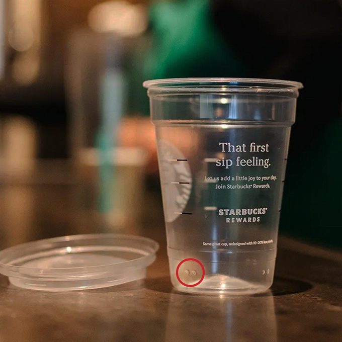
The raised dots on your Starbucks cup are not just a design choice. They’re a clear step toward greater inclusivity and accessibility. “Raised dots signify different sizes that can be felt by the swipe of the thumb for those with low visibility,” according to the brand’s website.
Here’s how to use the dots to determine your Starbucks coffee size:
- One dot: Tall
- Two dots: Grande
- Three dots: Venti
What else is new about Starbucks’s cold-drink cups?
Starbucks’s cups are designed to improve accessibility on multiple fronts: The raised dots help low-visibility customers figure out their cup size, and two additional updates make it easier for baristas to move quickly and accurately.
Embossed letters
You probably won’t see them once your cup is in hand, but the letters on the bottom of each cup are embossed. The raised letters (think V for Venti) help Starbucks employees grab the right size cup by touch alone. Since cups are all stacked upside down, this quick and easy size confirmation speeds up service during busy stretches of the day.
Black-and-white fill lines
One thing you’ve likely noticed: All Starbucks cups have black-and-white fill lines that indicate measurement specifications to baristas. And there’s a good reason both colors appear on your cup. Black and white create a sharp contrast against light (black) or dark (white) drinks, so people with low visibility can see them as clearly as possible.
Why trust us
At Reader’s Digest, we’re committed to producing high-quality content by writers with expertise and experience in their field in consultation with relevant, qualified experts. We rely on reputable primary sources, including government and professional organizations and academic institutions as well as our writers’ personal experiences where appropriate. We verify all facts and data, back them with credible sourcing and revisit them over time to ensure they remain accurate and up to date. Read more about our team, our contributors and our editorial policies.
Source:
- Starbucks: “New, more sustainable Starbucks cold cups are made with up to 20 percent less plastic”